Wishare
Adventure planning for travellers
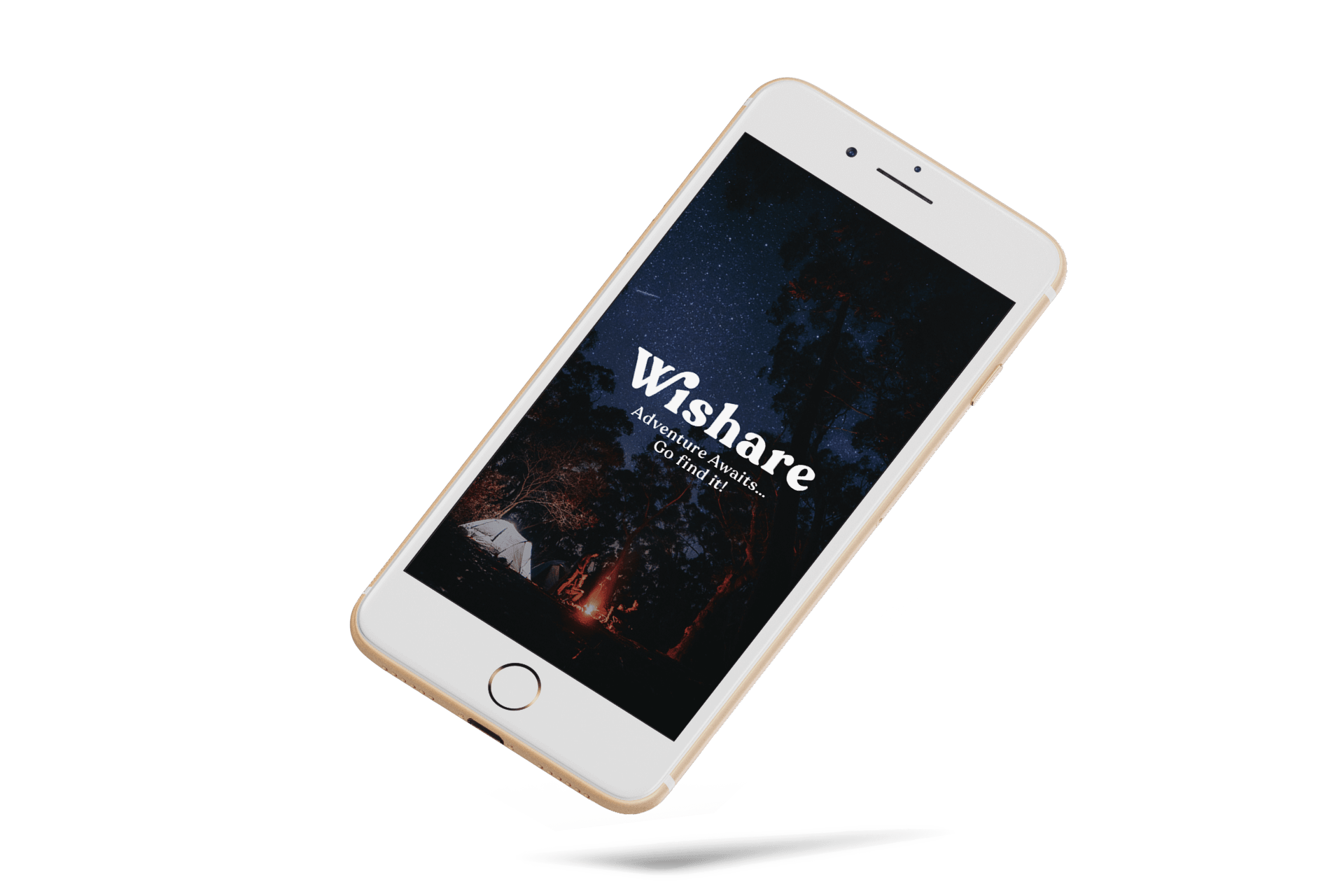

Wishare is a mobile travel app used to find travel adventures curated by locals. The app is designed for millennial junkie travellers who are interested in finding Off-the-Beaten path experiences that create moments worth sharing & long lasting memories.
My Role
Strategy
Research
UX/UI
Timeline
Feb - Oct 2019
Prototype
Wishare aims to assist travellers in finding the right plans and helping them connect with locals. Thus also bringing together the travel community
Design Process
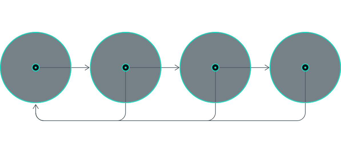
This project was designed using the design thinking process – a user-centric approach, based on heuristic research, validated assumptions and repeated user testing.
Think & Solve
Understanding the Problem
What current digital products are helping travellers connect to the place they are visiting?
Recently the emergence of the social networks and the low accessibility cost (low barrier to entry) of travelling has contributed to a democratisation of travel.
This changed the travel attitudes and behaviours of consumers that now crave new and different experiences that will make their trip feel unique and authentic to the place they are visiting.
The paradigm shift made available endless new possibilities for travellers: recommendation editorials, site review, portable maps, digital check-ins, transportation apps, and local accommodation. But how are travellers discovering things to do everywhere they go?
What is out there in the market?
The images below present some of the players servicing the space and how they are doing it (competitive analysis).
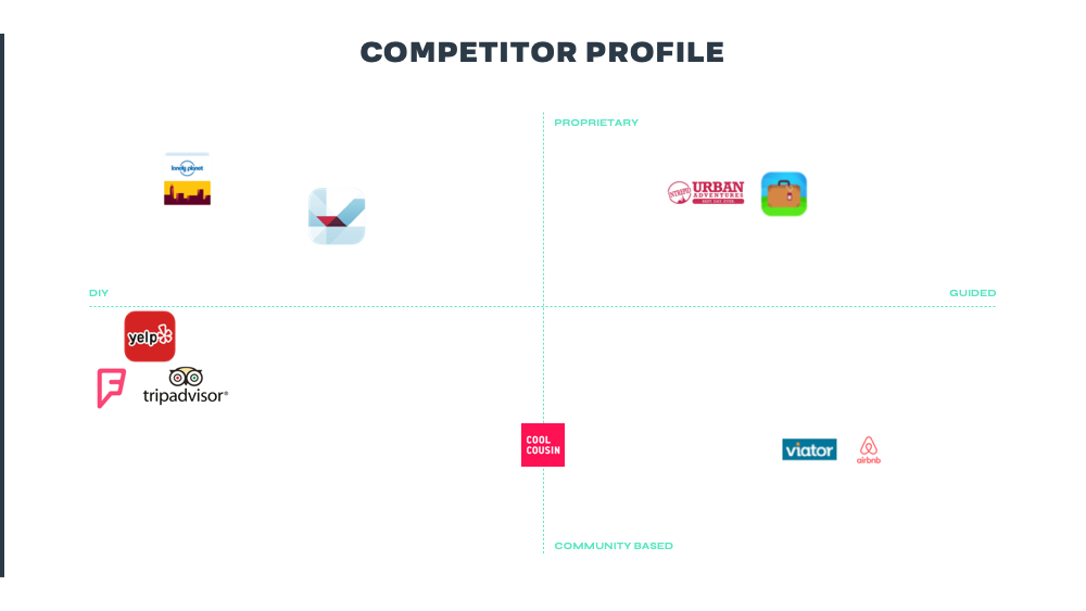
One thing that stands out is that there aren’t many players that offer DIY travel guides and guided experiences at the same time.
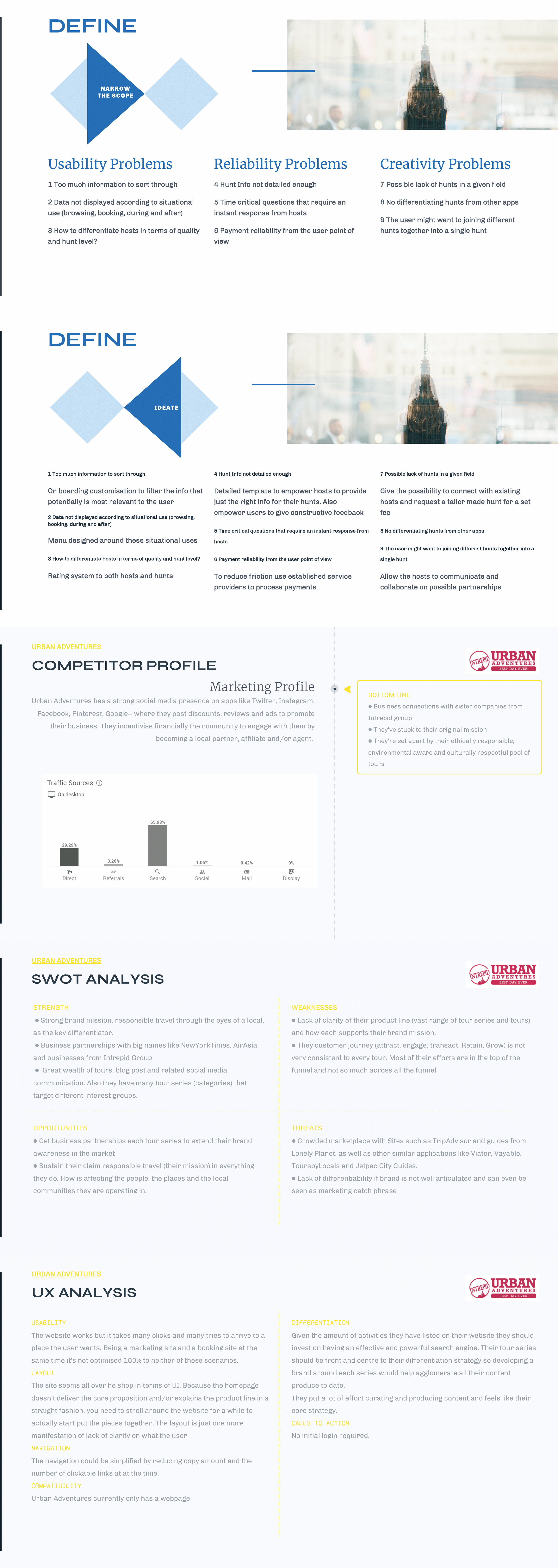
This analysis gave me the insight that depending on which stage the traveller may be (inspiration, narrowing options, designing a plan, booking, experience, review) they might use different apps for that.
I can only ask myself…
Is there room for improvement?
Yes! So far, there are 3 requirements to address the brief. The product needs to:

1
Be a web application to be in every traveller pocket.

2
Connect travellers with local insiders.

3
Help travellers throughout all the ‘user journey’ (from inspired to
delighted)
What would make a successful product?
User-Driven Hypothesis:
I believe that by creating a holistic product that eases the process of researching activities to do and that makes accessible a closer connection between visitors and locals, I can positively encourage users to promote a culture of trust and understanding. I can measure this through qualitative research on the positive impact the product has on users’ travel behaviours.
Business Driven Hypothesis:
I believe that by allowing hosts the opportunity to rep their towns and their area of expertise, I will be able to support the creative spirit of each city and this way generate an economic impact that is sustainable and respectful to these communities. I can measure this by the number of new weekly members, the number of booked adventures, active users, delighted travellers, the daily number of messages in the community, etc.
Problem Statement
Millennial Travel Junkies need a way to easily discover off-the-beaten-path experiences to spice their travels
The Reason
Because these discomfort seekers want a fulfilling and unique way to express themselves through their travel plans experiences to spice their travels
The Measure Of Success
We will know users are happy with the app when the user base grows beyond these trends-setters and the pool of activities extends consistently
So, what was our solution?
A platform that builds connections between travellers and local insiders. A safe community where people can share their passions. A platform where insiders share their off-the-beaten-path plans to do in their surroundings. A platform to discover a place through the lens of a local expert, leaving behind all the typical tourist traps and wasted hours of research.
More precisely, this is what we need:
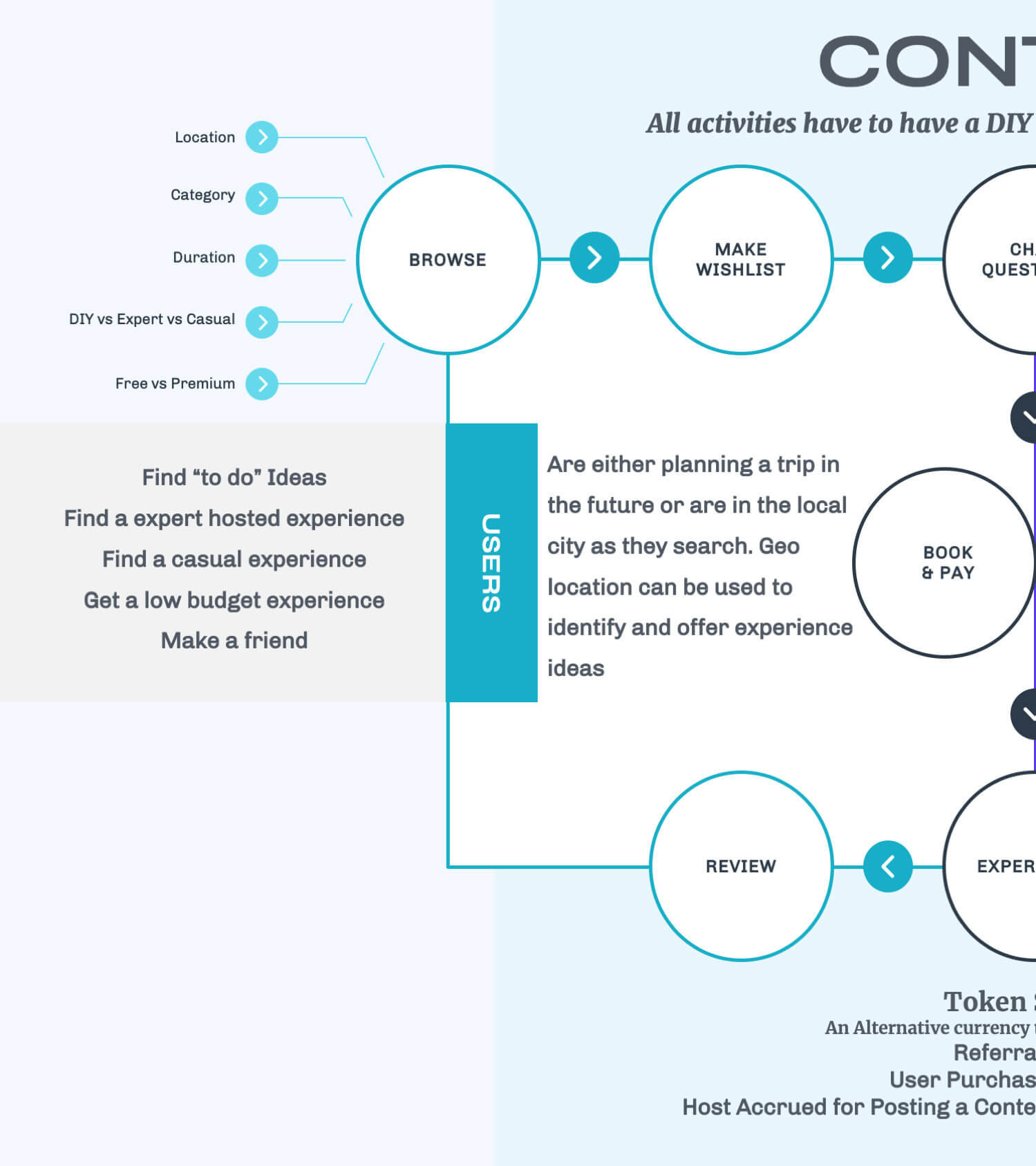
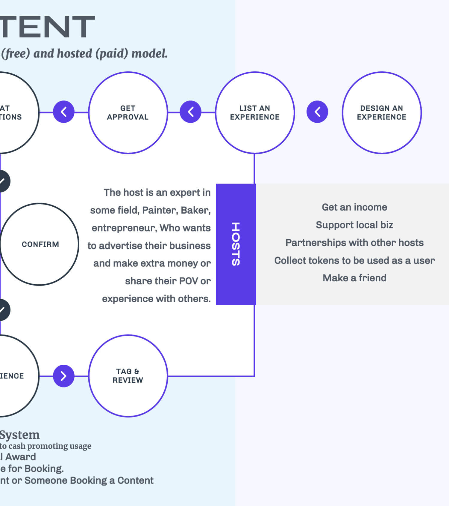
At this stage, I have already formed a brief idea about where our product was going to go but needed to understand who would use it and how.
Empathising with the User
Whom am I designing for?
I started by surveying 14 avid travellers within my network, to get insights on what are their attitudes and expectations towards travel plans. I refined and validated the findings by conducting 6 interviews.
I then analysed the collected responses by focusing on the behaviours, needs, goals and frustrations and created an affinity map. Doing user research helped me identify 3 categories of possible users.

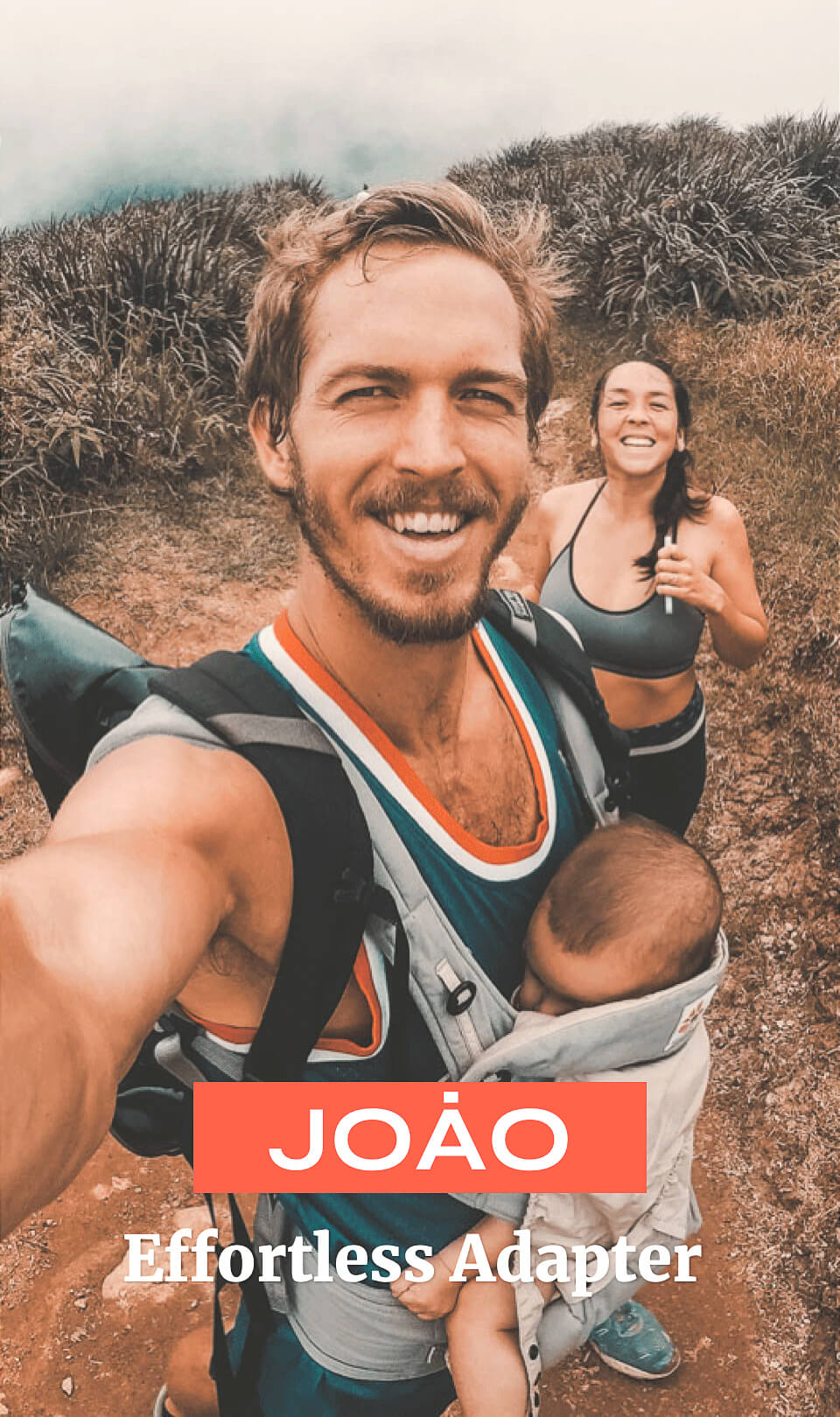

Understanding who was going to use the product helped me keep users needs and motivations as the top priority.
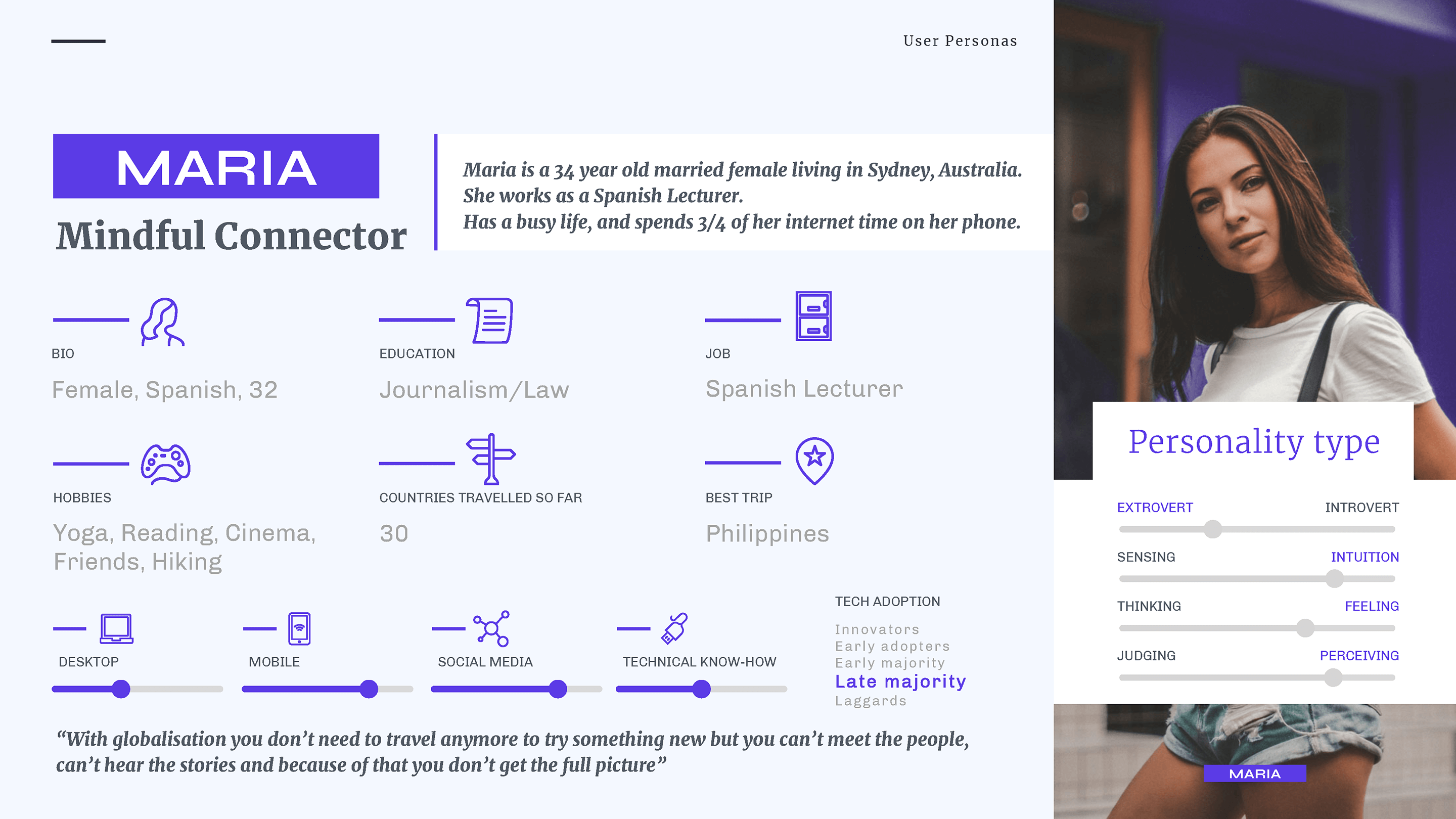
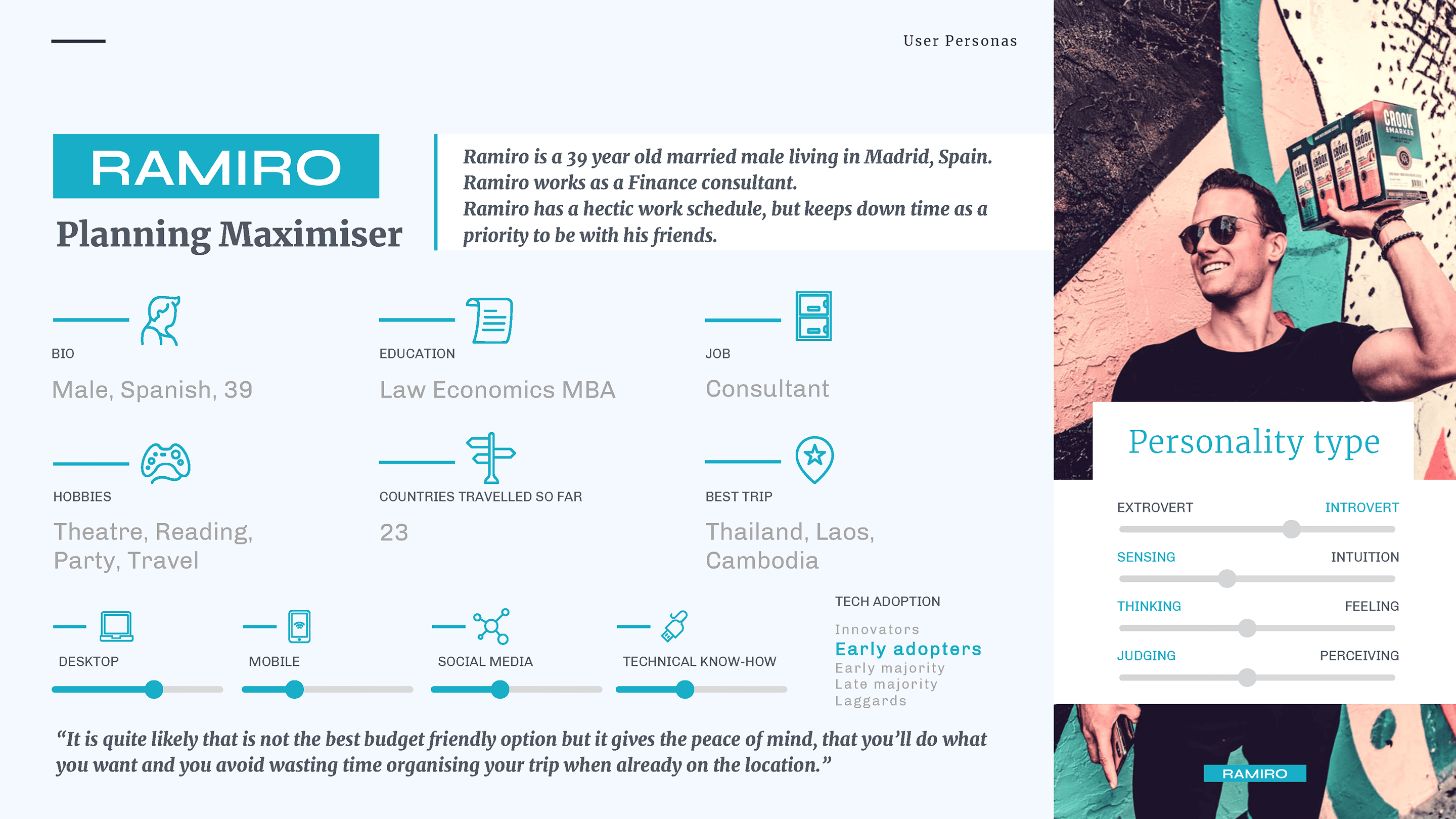
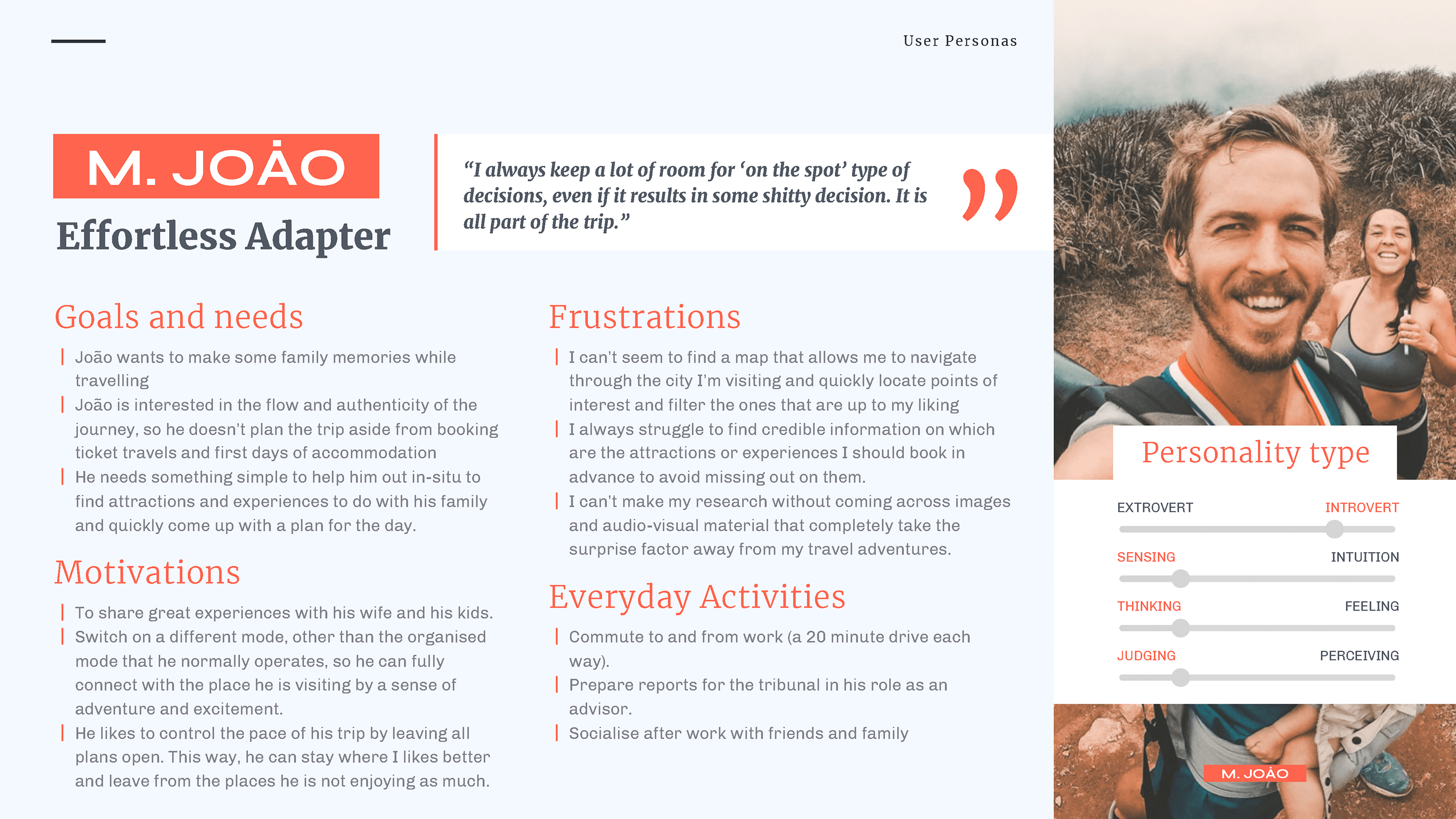
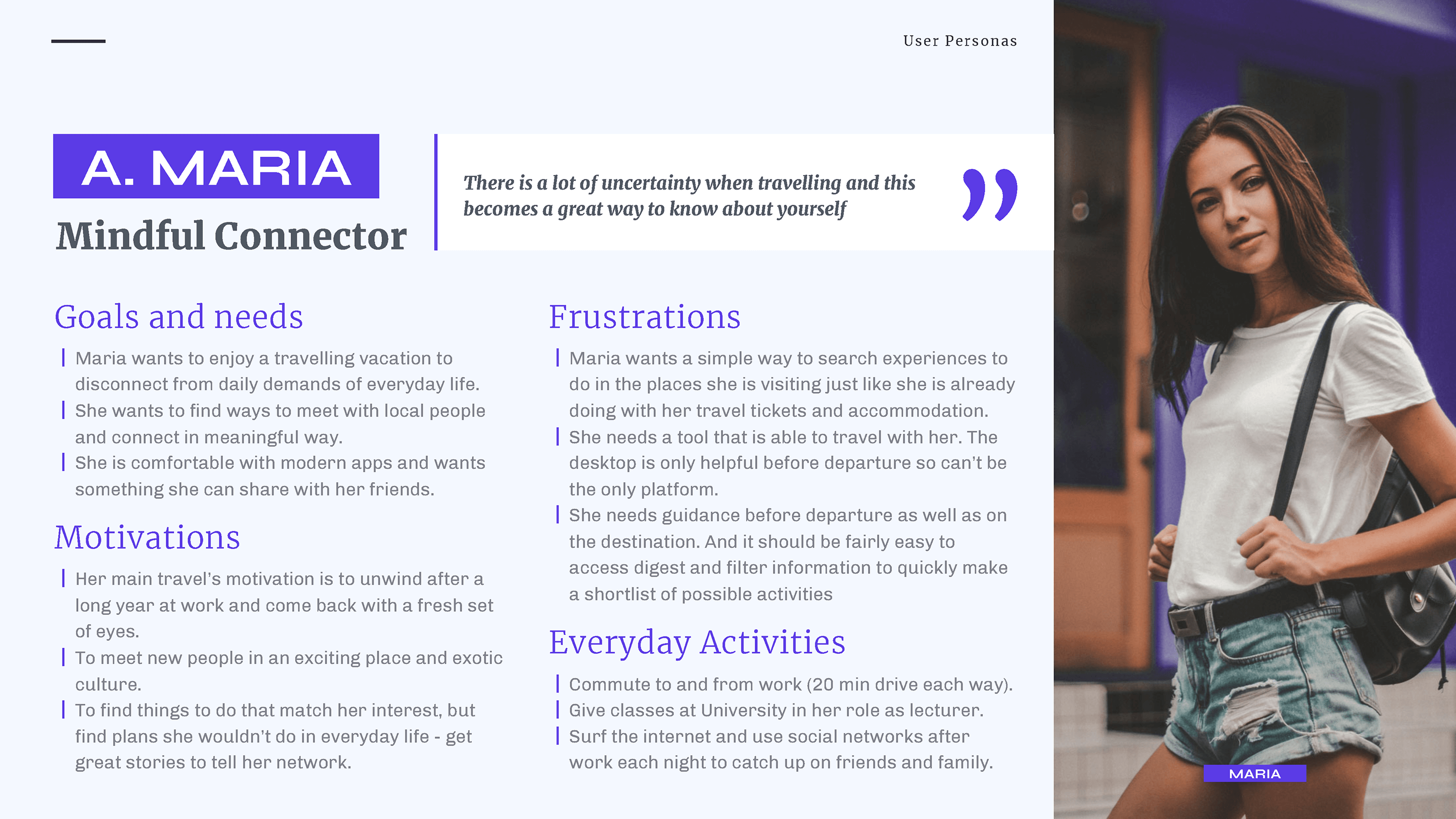
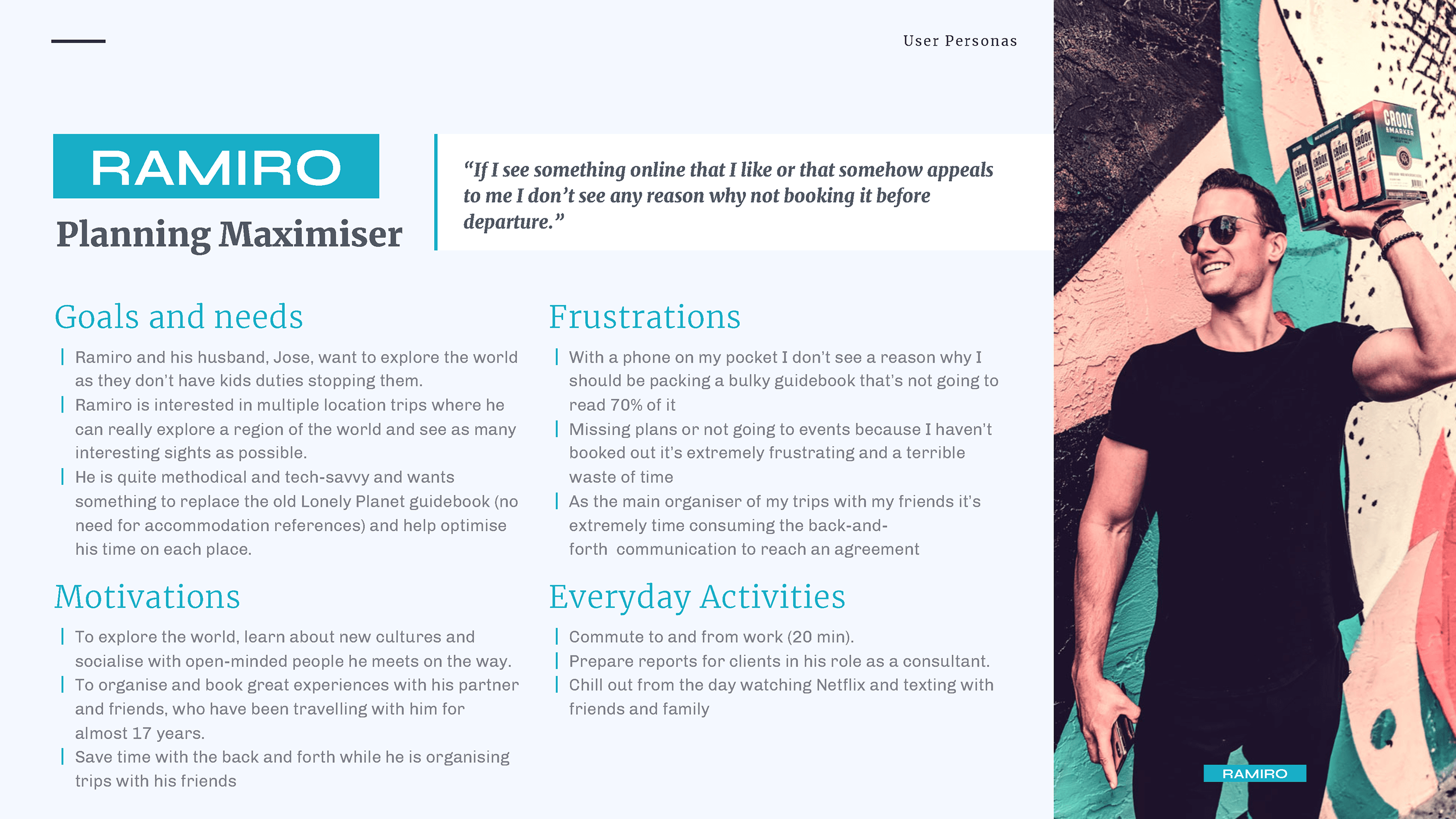
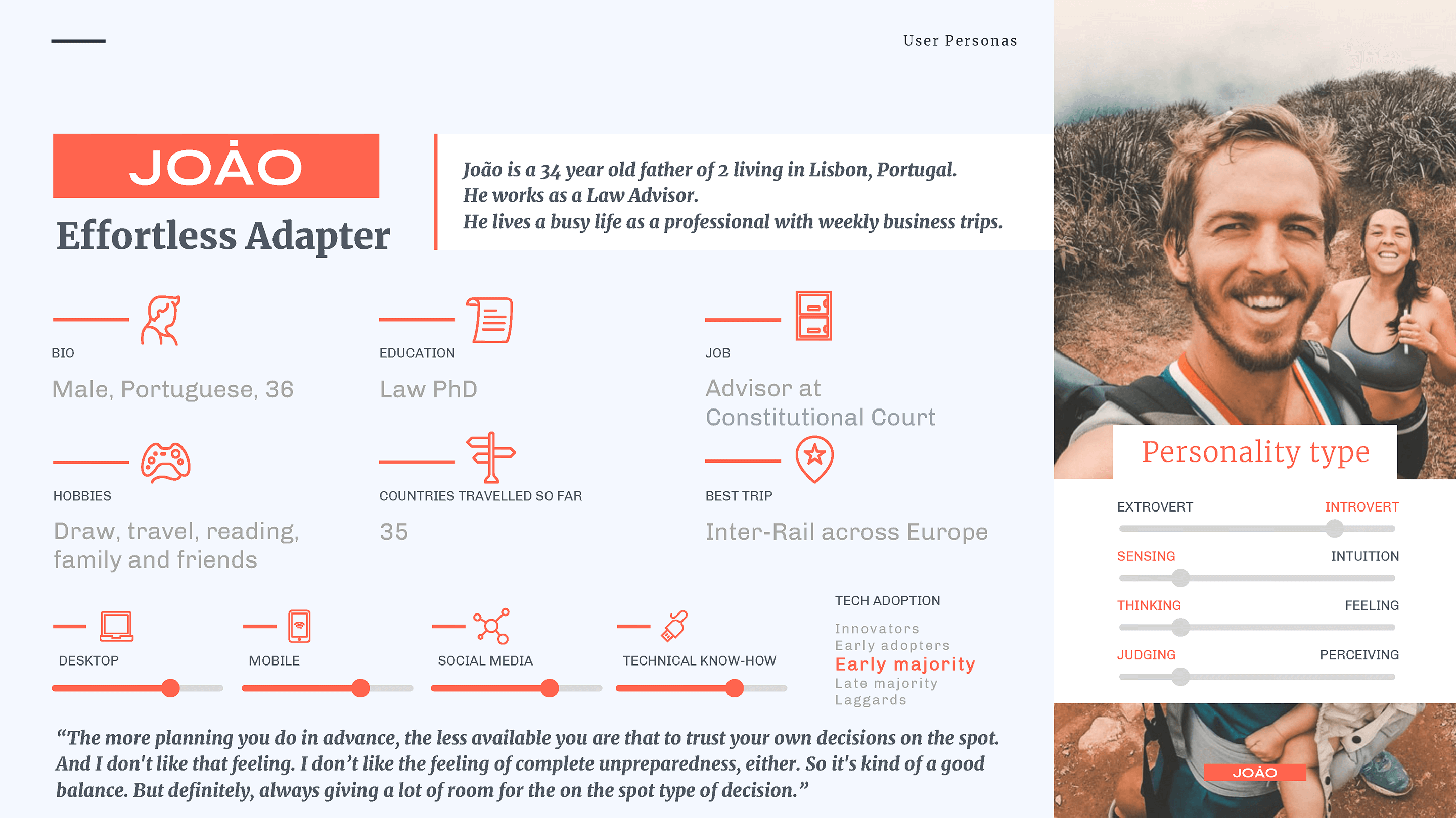
This was a great insight as I wrongly thought at the beginning that everyone could benefit of using the product. Why wouldn’t we all want to discover and book adventure to do anywhere we go? It turned out that this wasn’t the case, as people’s opinion differ quite considerably when talking about planning and booking.
How to deliver on their expectations?
I wanted to provide the users with the best experience, so the next step was to identify core use cases based on what the users would mostly need in the app.
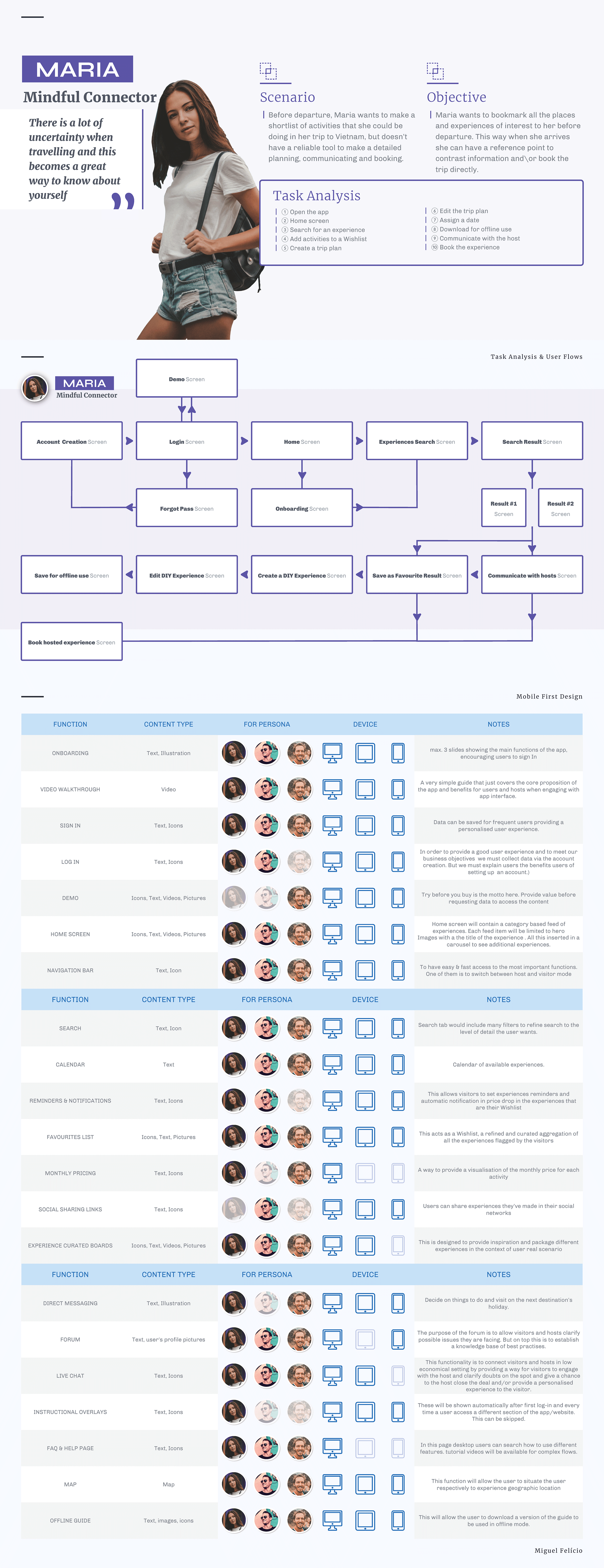
Adding empathy maps, user stories, user journey and user flows into the context made my process easier and helped me organise the content keeping their specific needs, emotions, and situations in mind.
By identifying core use cases as “dreaming moments”, “planning moments”, “booking moments” and “experiencing moments”, I was able to prioritise features and started planning the navigation.
After that was done, we were able to prioritise features and started planning the navigation. The main feed is also structured as a map of the adventures you could spot in the surroundings. Since the discoverability of adventures is key in the interaction, I used a map view and a list view so the user can browse and find their preferred adventure based on their geolocation.
But how do users find and navigate through this content?
First thing that needed to be done was to analyse all the content types and organize it following a logical structure, to know exactly what I am dealing with.
Card sorting was great in helping me define the categories of information.
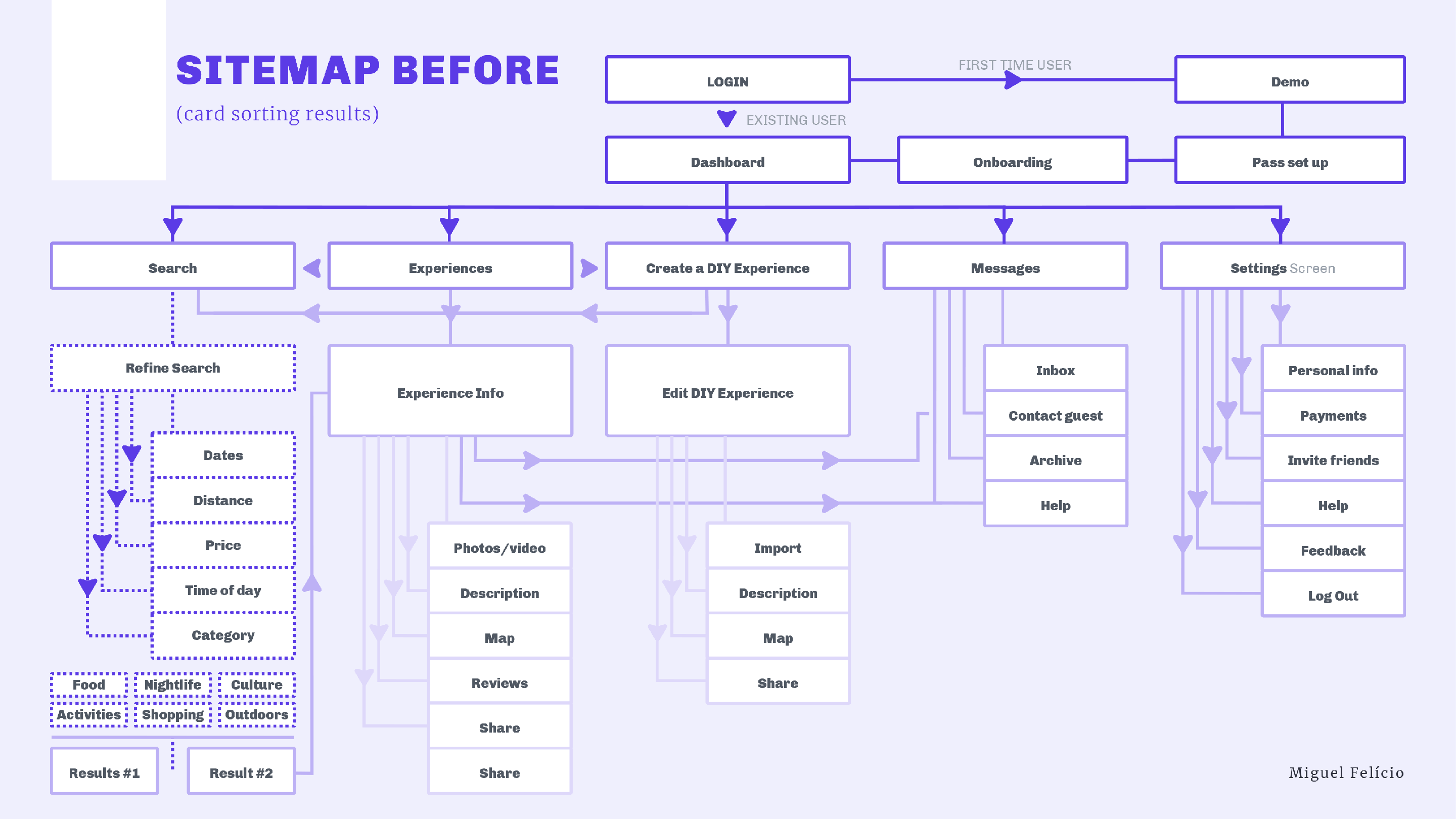
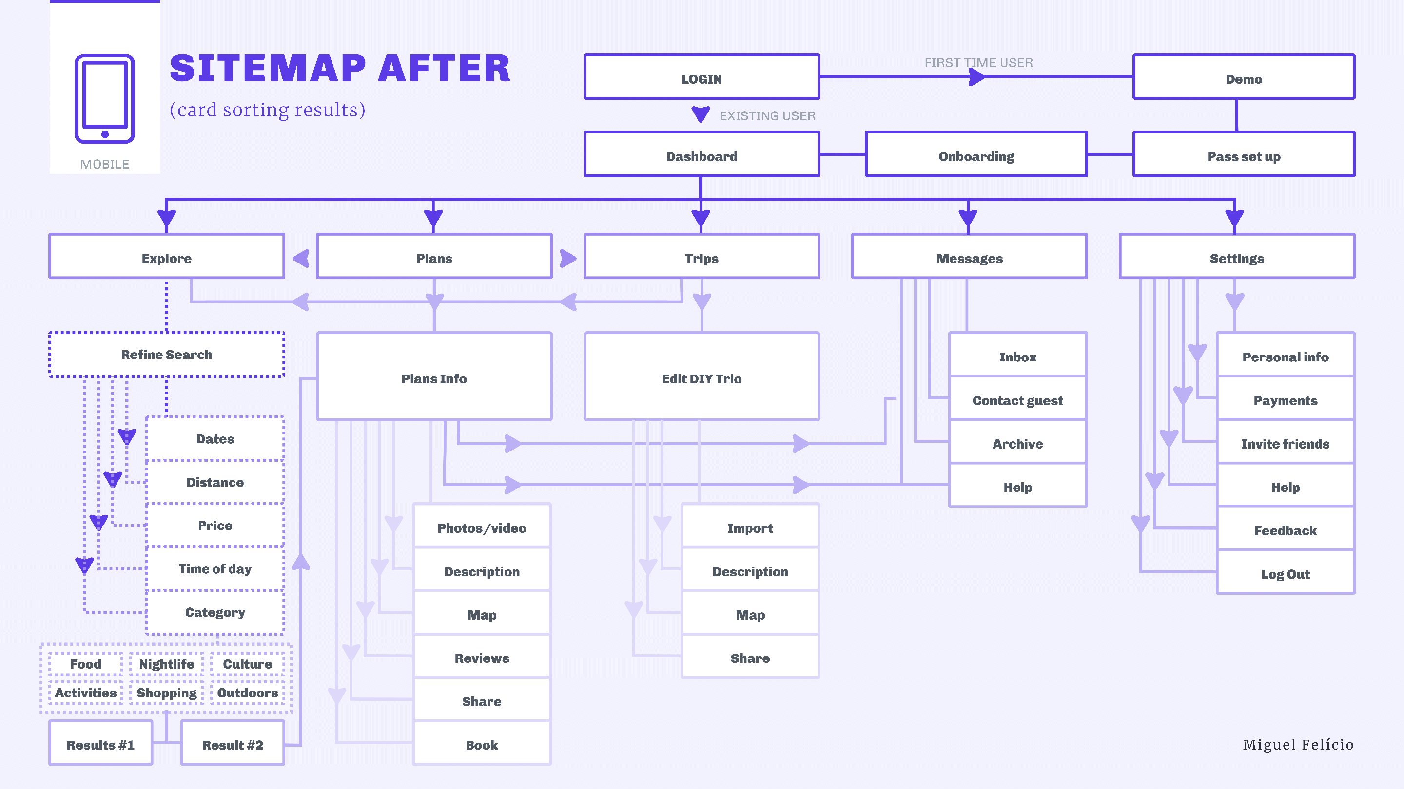
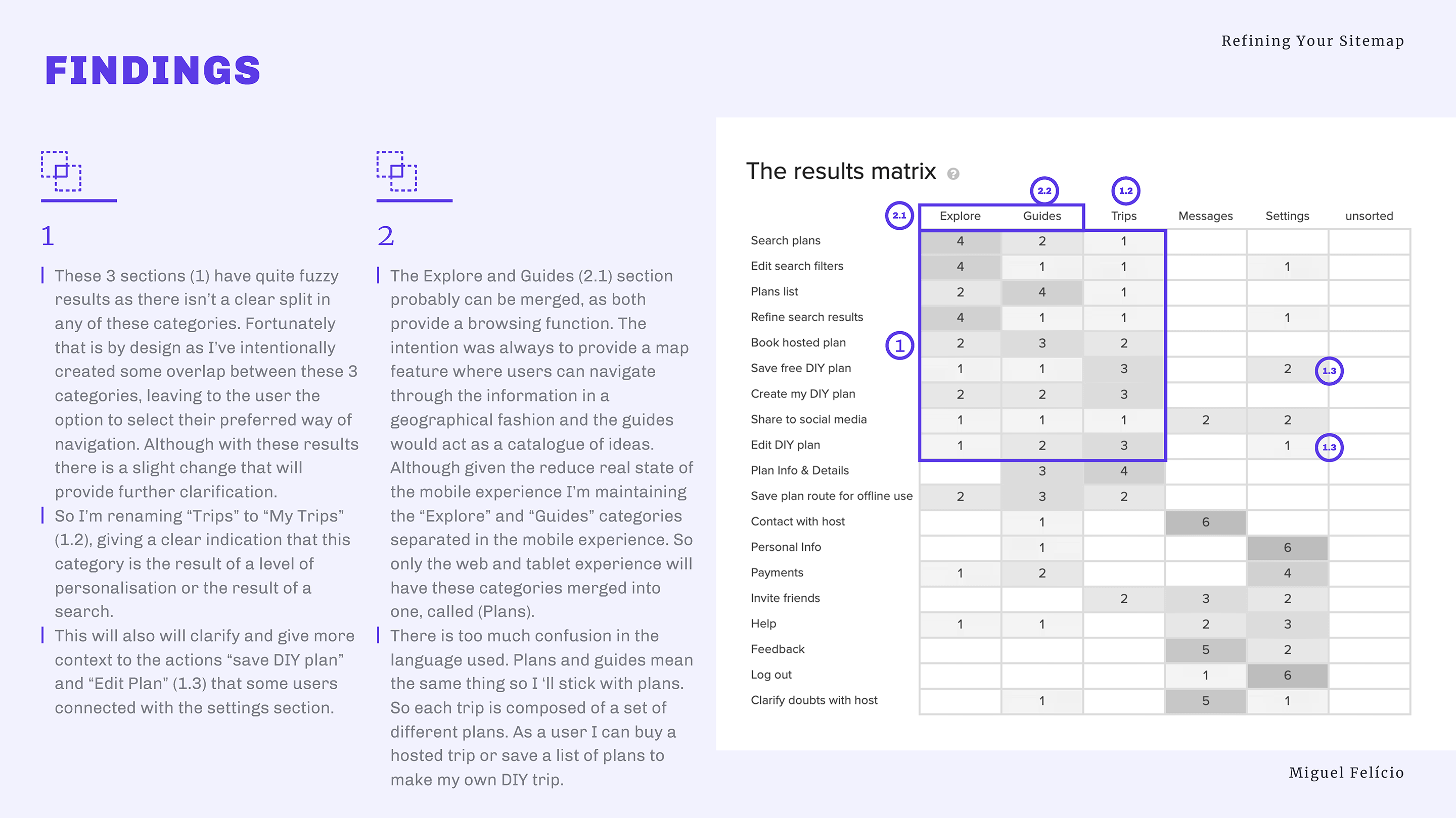
However, I have learnt that labelling is key.
Even a slight difference in wording can influence the results. A clear example of this was the term used to express travel activity. Went back and forth between tour, experience, plan, guide, and eventually landed on the adventure. This seems to reflect better the psychographics of the millennial generation and instils a sense of thrill and fun.
This may be a little detail for some, but using the same terminology you are to use later on your platform, proved important to me.
Build & Design
Letting the Ideas Flow
Do all the pieces connect back together seamlessly?
Working with pen and paper was great in iterating fast, it allowed me to correct my mistakes early in the process and adjust them with little to no cost.
Working with pen and paper was great in iterating fast, it allowed me to find basic coherent navigation and put to the test the user flow designed previously.
The mid-fidelity allowed me to design the user interface, discover inconsistencies in the user flow and start testing the microcopy in the flow.
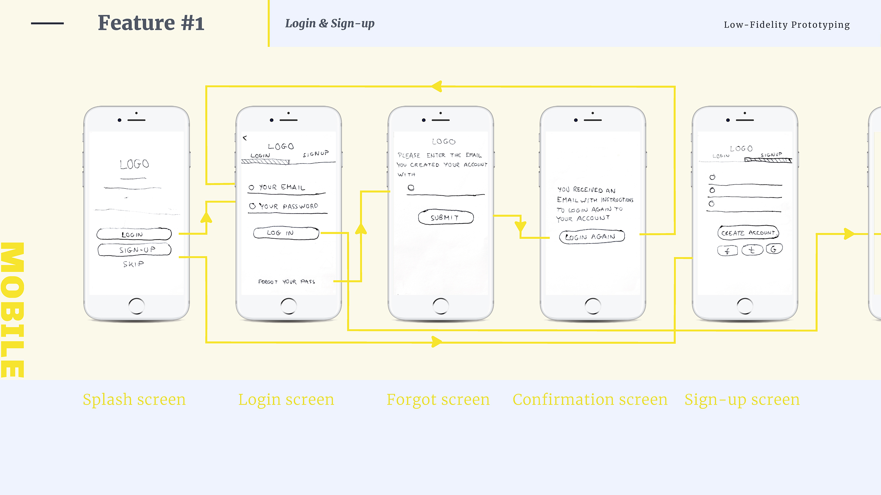
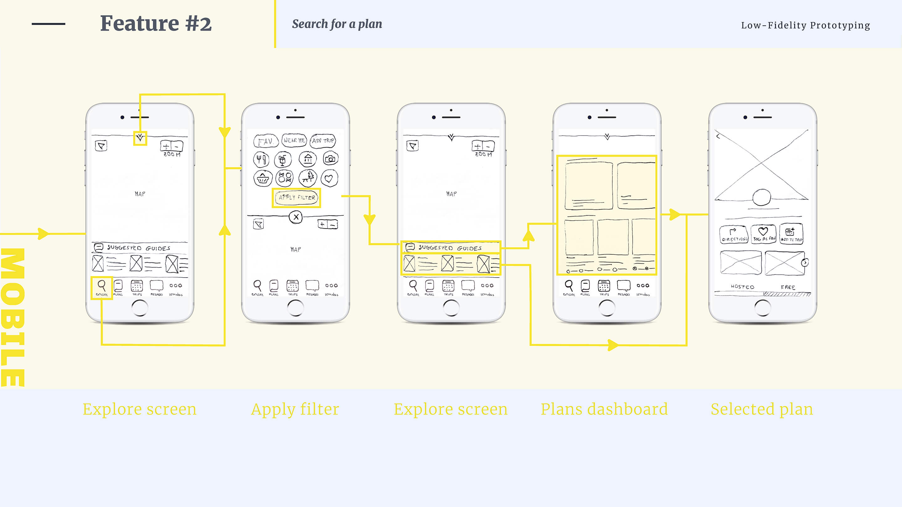
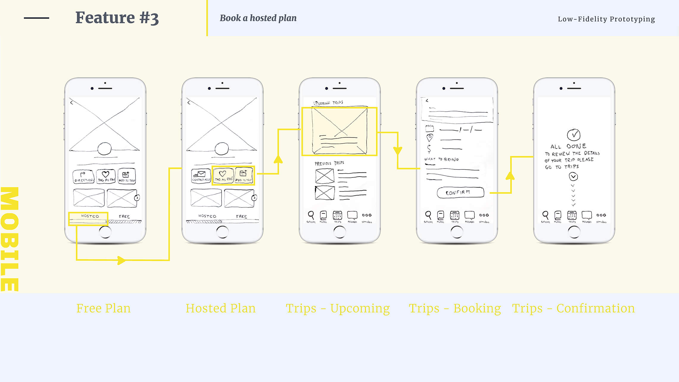
High Fidelity Prototyping let me set in a high level of details and test the functionality of the product. I could finally test the core features of the application (browse and book an adventure) and the interactions between pages.
The visual elements were not defined yet, I didn’t decide about the graphics and colour scheme but at this stage I was most interested for the product to function well.
Test & Launch
Putting Ideas to the test
Am I getting close yet?
I’ve conducted six in-person Usability Tests to gain hands-on feedback for my prototype and to improve the design in future iterations.
To cluster the outcome, I’ve used the method of Affinity Mapping again.
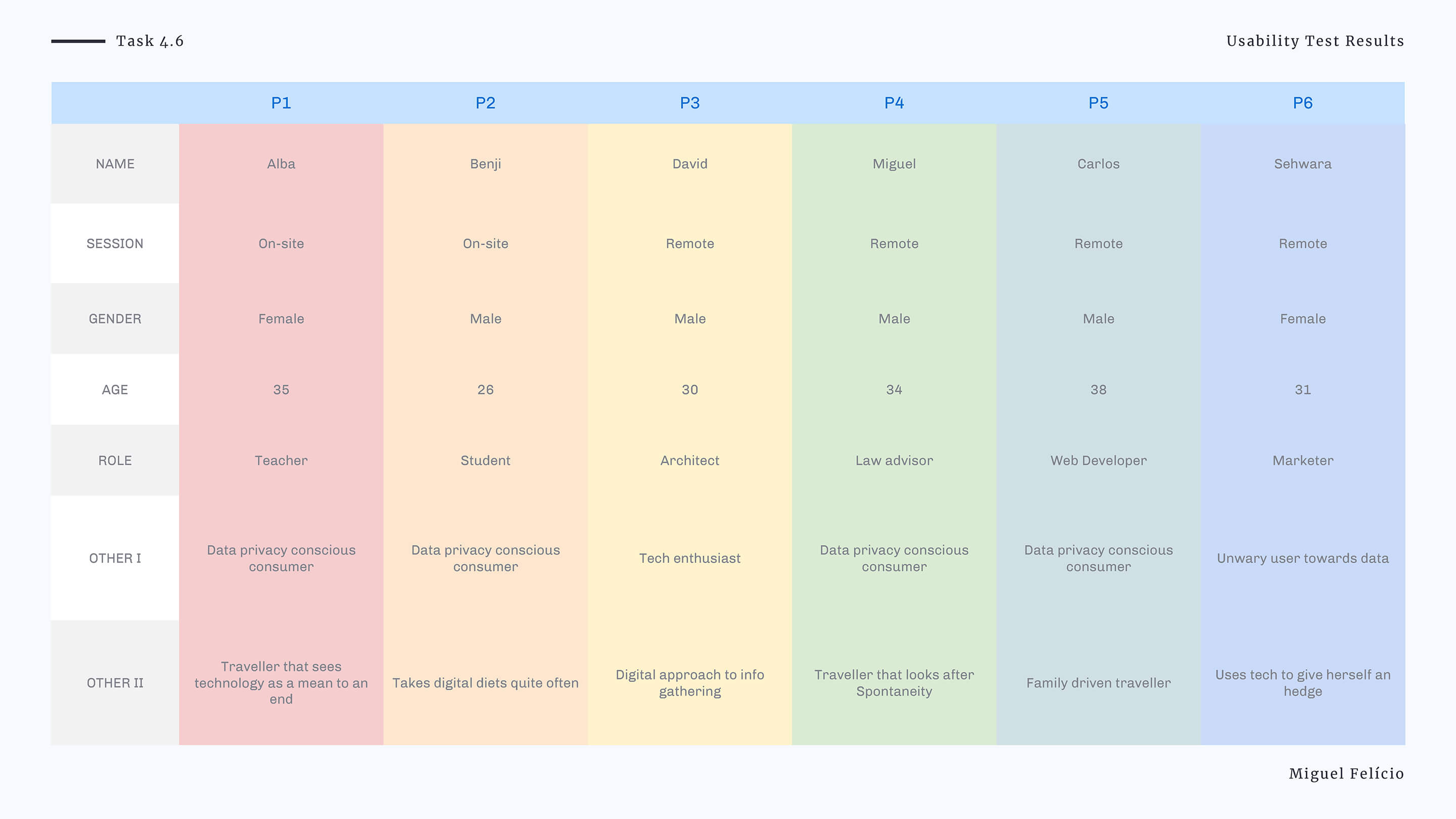
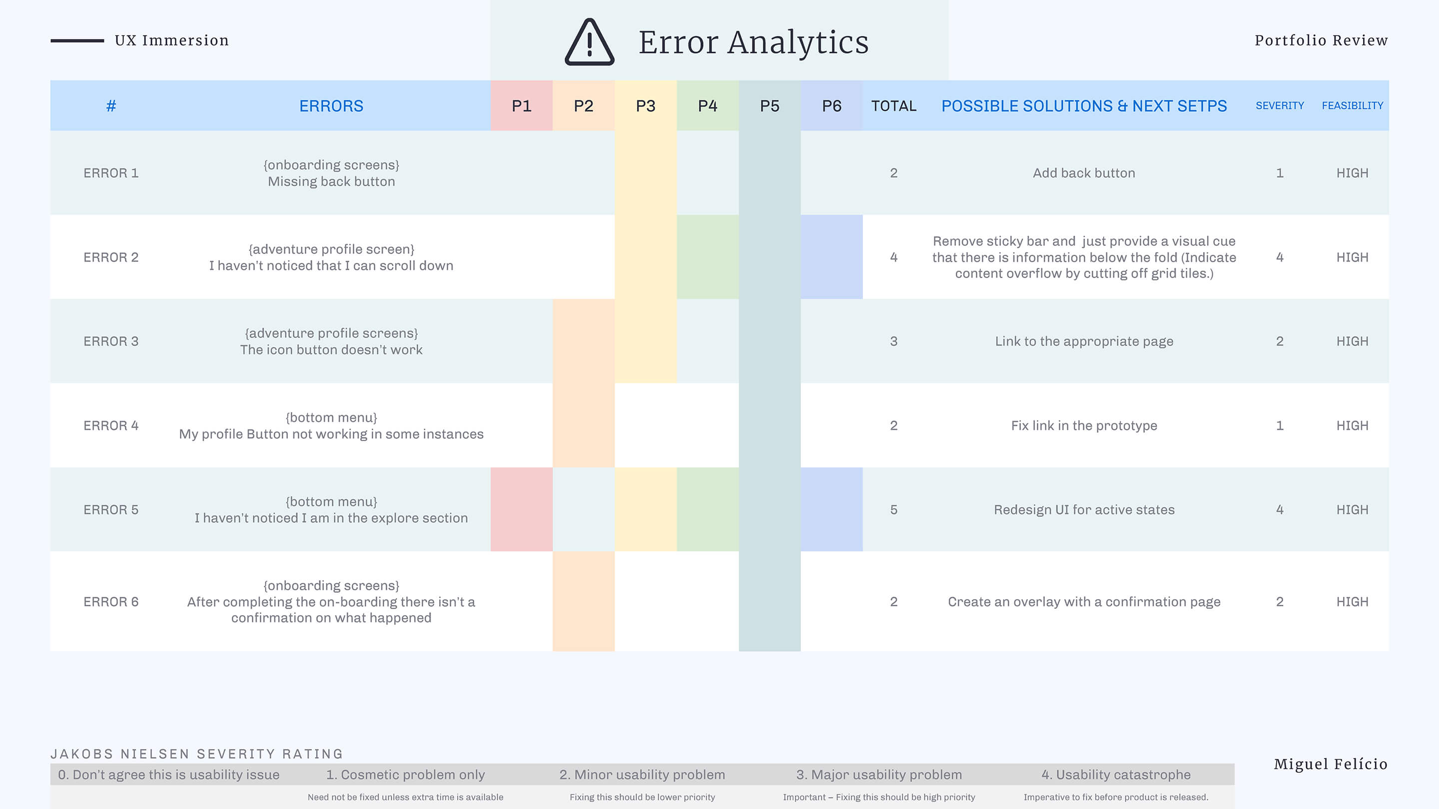
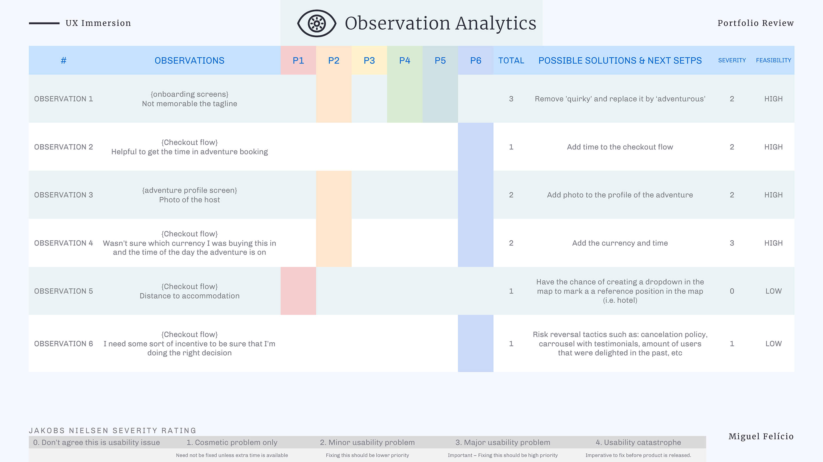
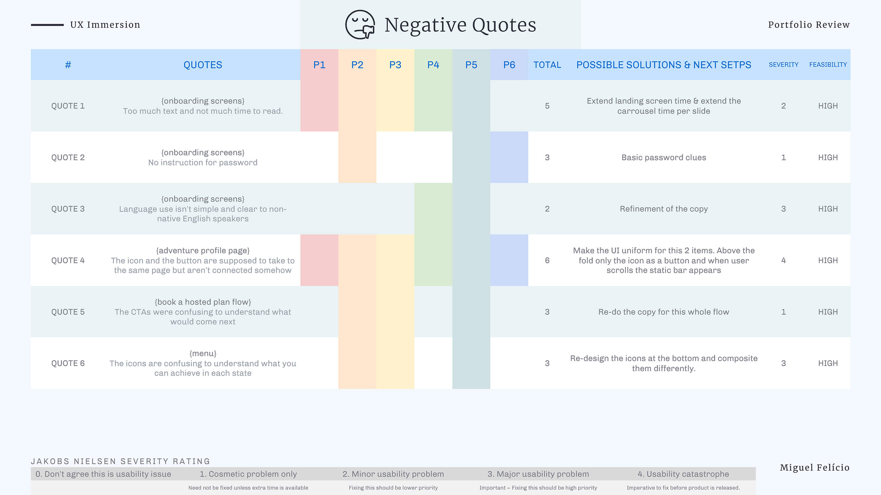
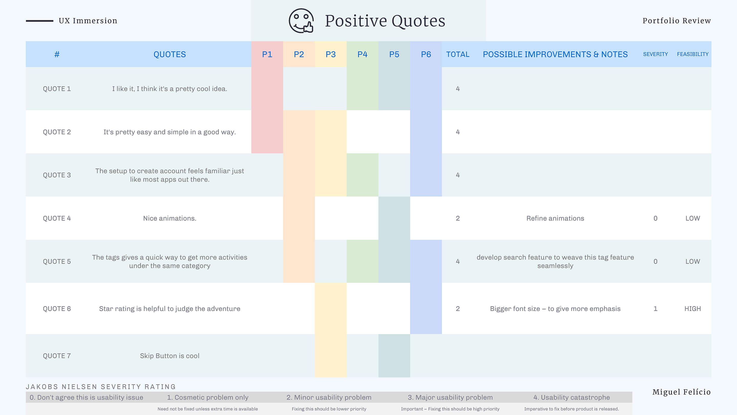
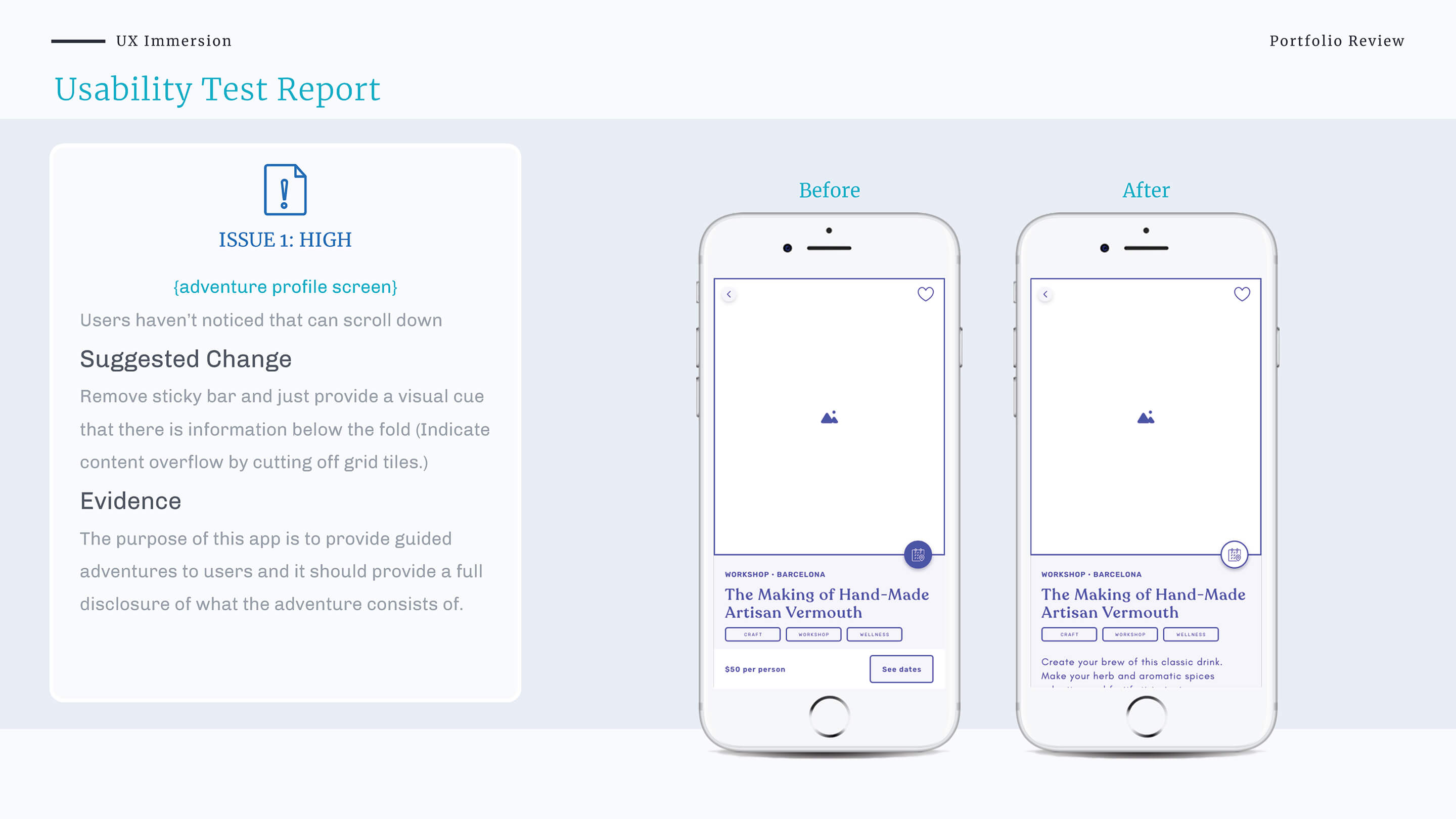
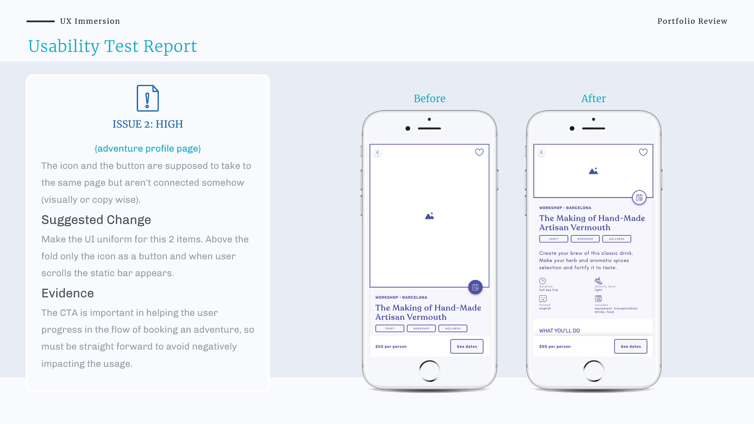
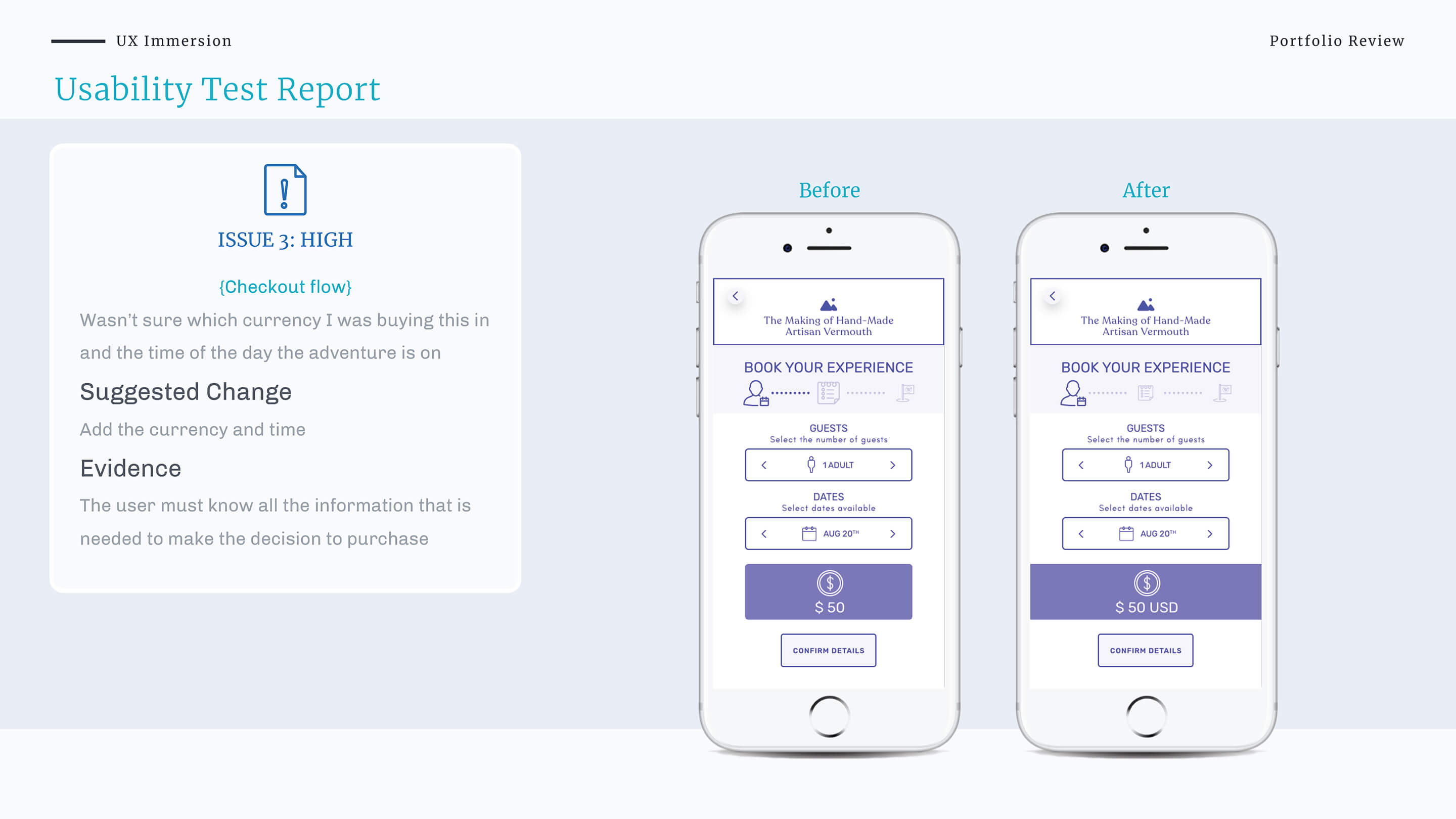
After analysing the tests results, I identified several user frustrations and errors. Based on their frequency and severity, I prioritised 5 issues to be fixed in the next iteration.
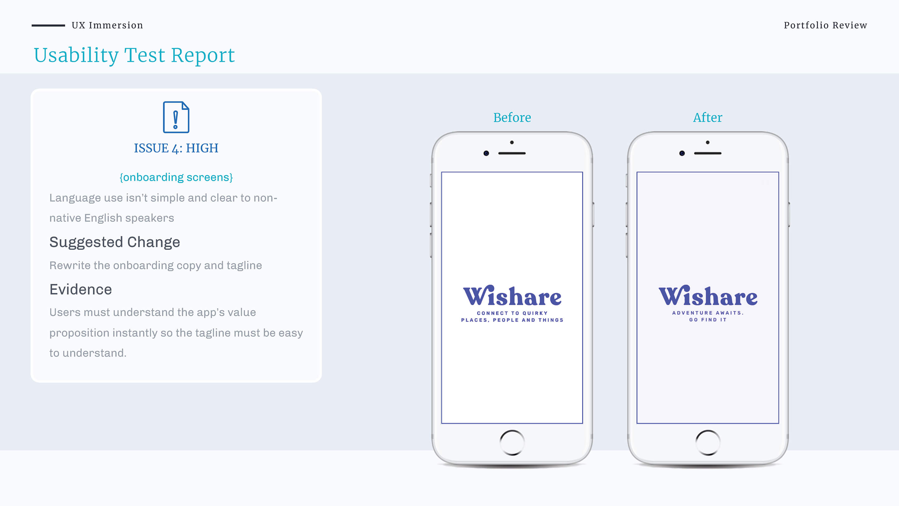
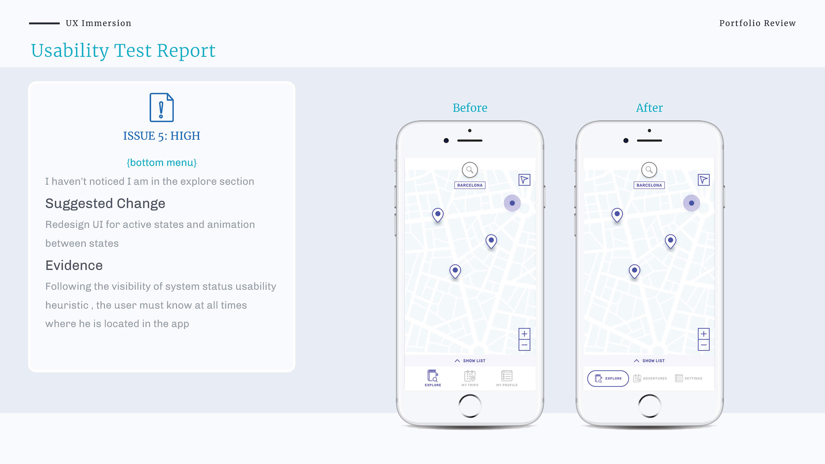
Refining the Design
How to use visual elements to enhance the experience?
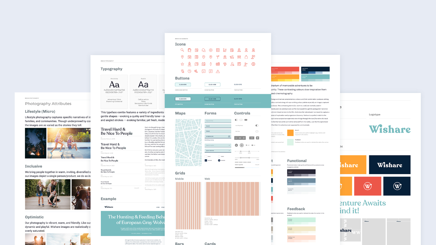
During this stage I have learnt a lot about the principles of design, emotional design and accessibility. The biggest challenge I have encountered was related to the yellow colour that I have used in the design - applied on text. It was also the colour used for interactions and didn’t pass the AA accessibility standards. I couldn’t change the hue as it represented the logo so I had to modify all the design. I have then opted for a darker colour for the text and used yellow for emphasis and accents instead.
Measure & Learn
Delivering the Product
The end result?
I am happy with the end result. I think a thorough understanding of the problem helped me decide in an informed and advantageous way.
Designing for the travel space is challenging but rewarding. It implies designing for all the travel customer journey moments(dreaming, planning, booking and experiencing moments), designing to encourage healthy interactions among users and encourage behaviour change by changing perceptions and challenging stereotypes.
However, I wish I would have had more time to investigate the problem from the insider host point of view. Understand what moves them, so I could design all the incentives to attract these types of people into the platform.

Learnings & Insights
Take aways for future projects:
User research is hard work. But the return on investment is High
Is like flossing… You know that you should do it, but the prep work is so time consuming that you feel no progress is being achieved. But if done right and planned carefully your product won’t bleed…
Strip it all off!
Adjust, rethink, replace, experiment, simplify, improve. When you think you’re done, you probably have to refine it even further. KISS (Keep It Simple, Stupid)
Copywriting is a craft. Master it
Every single word choice counts. Giving a tone of voice to your copy is an amazing brand building tool, but comes at a cost. Does it communicate as well as neutral
Document the process and keep it handy.
The design thinking cycle is long and there are many moving parts, which makes the project’s scope constantly evolving. Documentation key to keep you focused.
Avoid assumptions
The hardest thing about this project was avoiding assumptions and thinking straight into solutions. I thought travellers had the same needs, pretty much like mine. During the research, I found out how I was wrong.